Skip to content
← All work
[Sports]ESPN

UFL Graphics Package

Season graphics package for the UFL on ESPN: type, transitions and lower thirds for every broadcast.

ClientESPN
CategorySports, Broadcast, Design
DisciplinesDesign · Animation
StudioWorkprint

NOT A GRAPHIC. A SYSTEM.

UFL Season Toolkit

A season campaign has to keep making sense after launch week.

New opponents. New matchups. New footage. Another topical spot. Then the playoffs arrive and the stakes change again.

The United Football League is professional spring football. ESPN brought Workprint in to develop the visual language and animation toolkit for its 2026 UFL season marketing. The brief included Anthem and Team-v-Team work, with a look ESPN's own team could adapt as the season unfolded.

The job was to give that work an identity strong enough to recognize and flexible enough to use repeatedly.

One beautiful frame wasn't going to cover it.

Workprint: Design and animation for ESPN’s 2026 UFL season marketing toolkit. ESPN: Campaign editorial and internal template assembly.

DESIGN FOR USE #100, NOT SCREENSHOT #1.

A hero image can be made to behave. Choose the ideal footage, the right words, the perfect amount of information and the cleanest composition.

A working campaign toolkit has to survive other people's footage and the next week's brief.

For UFL, that meant developing a visual language with repeatable parts. Typography, team identifiers, matchup elements and treatments for the footage needed to feel related, even when the content inside them changed.

ESPN needed energy and recognition across the season's marketing. We needed to build enough character into the system that it stayed identifiable, without making every new execution an exercise in rebuilding the original spot.

The next version is where the design starts proving itself.
UFL campaign typography over game footage

PUT THE DESIGN INTO MOTION EARLY.

We explored design directions, then developed the strongest ideas against ESPN's kickoff Anthem cut.

That gave the work a real editorial context. Typography had to move with football. Footage treatments had to create a recognizable world without losing the action inside it. The motion needed to work at the pace of a promo, not only in a presentation of individual frames.

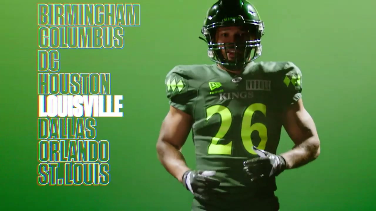
Prismatic treatments and kaleidoscope effects became part of the visual vocabulary, alongside animated type. Team IDs and Team-v-Team elements extended that vocabulary into the material ESPN needed for different games.

These pieces gave the campaign recurring behaviors. The same ideas could appear in different combinations, keeping the work connected without forcing every spot into an identical sequence.

UFL player footage with a spectral prism treatment

EVERY CHOICE BECOMES SOMETHING SOMEBODY ELSE HAS TO USE.

A toolkit handoff is where an attractive system can become a difficult one.

The user needs more than finished renders. They need to change the relevant information, adapt the treatment and assemble work in their own editorial context.

We supplied collected After Effects projects as well as rendered elements, including adjustable Prism and Font projects, team-name material and animation components. ESPN's editor used those projects to build an internal template.

That assembly belongs to ESPN. The important contribution from our side was giving the team a visual language and editable components it could actually work with.

This is a practical design standard: another editor should be able to pick up the project and understand how to keep the idea intact.

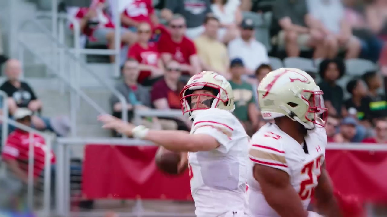
UFL game action, typography and team color

THE SEASON GAVE IT A REAL TEST.

The Anthem spots reached final approval in March. The toolkit then continued into the weekly marketing.

ESPN shared its use of the Team IDs and Team-v-Team graphics in Week 6, Week 7 and Week 8 topical spots. That's concrete evidence of the work extending beyond a launch presentation into the changing needs of the season.

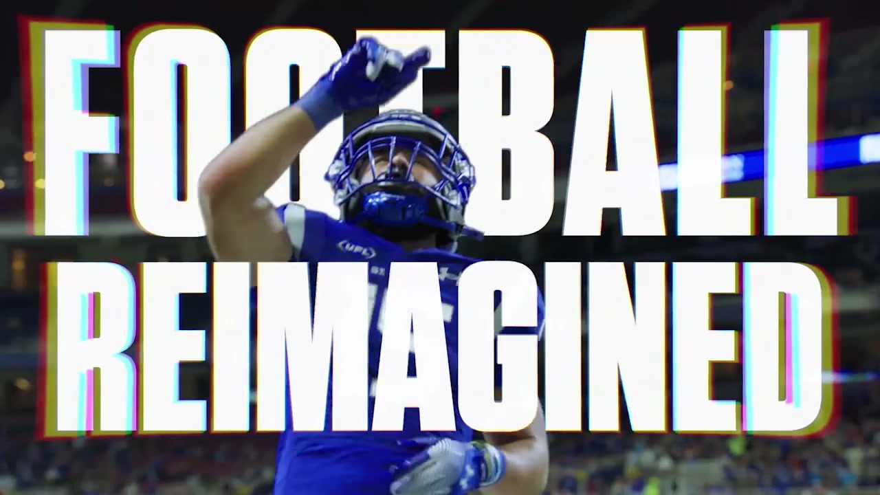
In May, we returned to develop silver and gold treatments for the playoffs and United Bowl, taking direction from the trophy. The campaign could signal a change in stakes while retaining the underlying visual language.

That extension matters. A system needs to stay recognizable, but it also needs somewhere to go. The postseason gave the toolkit another register without requiring an unrelated identity.

UFL Football Reimagined postseason treatment

SCALE CHANGES THE STANDARD FOR GOOD.

An individual graphic is judged in its own frame. A season toolkit is also judged by what happens when the frame changes.

Can a new matchup still feel like the campaign? Can a different editor use the components? Can a higher-stakes phase feel special without abandoning the work that came before it?

Those are useful questions for any brand building more than a single asset. They shift attention from the first execution to the repeatable choices underneath it.

UFL campaign typography over game footage

WHAT THE JOB ACTUALLY PROVES

UFL demonstrates design and animation built for continued use: a recognizable look, practical editable components, a working handoff and a postseason evolution.

It gives a producer more to evaluate than a hero frame. There is evidence of the toolkit being used in subsequent spots and adapted as the campaign's job changed.

UFL player footage with a spectral prism treatment

WHAT THIS MEANS FOR YOU.

Sometimes you're hiring us to build the thing that makes all the assets make sense.

A campaign toolkit. A content series. A motion language your team can keep using. We'll develop the look, put it through real editorial conditions and prepare the components for the people who need to make the next version.

Because the real test of a design system is Tuesday afternoon when somebody needs another spot.

UFL game action, typography and team color